From the work shelf

a font study

Instagram carouselPost date not supplied265 saves, 7,435 reach

A type study asks architects to look beyond Helvetica. Each slide gives one typeface its own space and a short, pointed line.
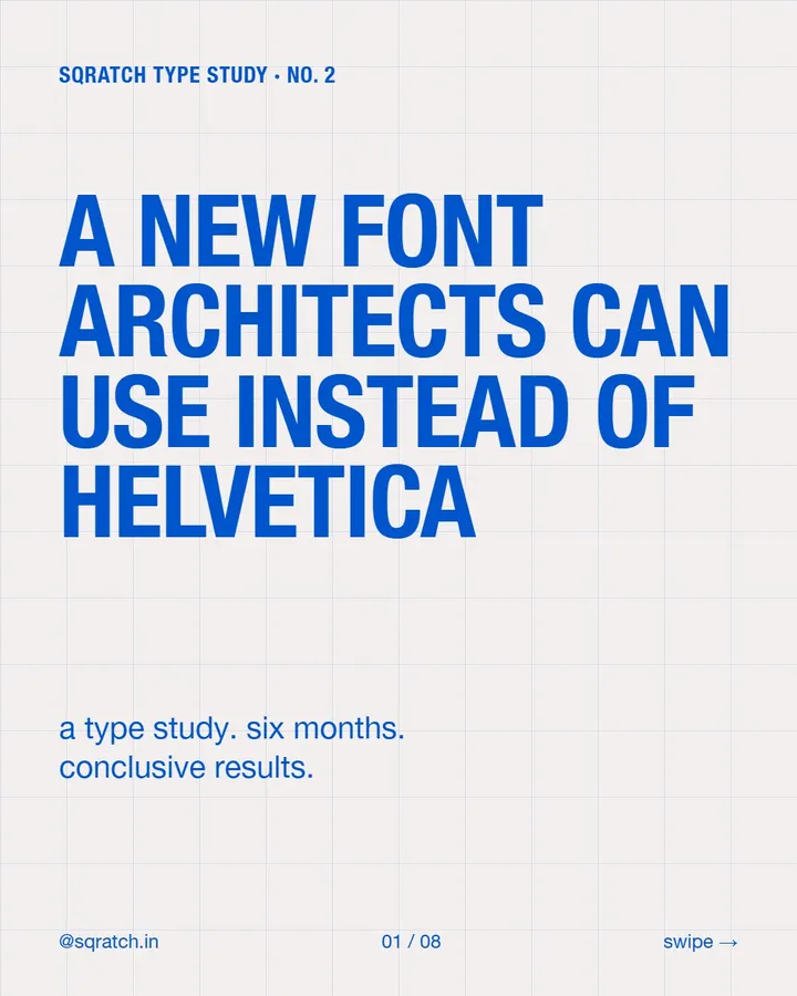
Blue type on a pale grid asks for a new font architects can use instead of Helvetica.
Available slide 1 of 4
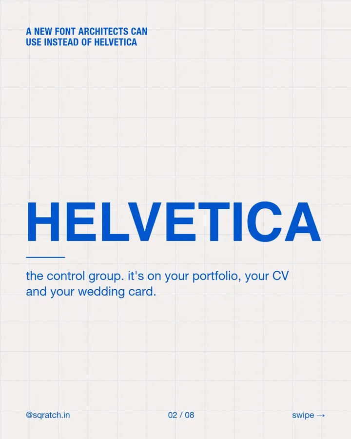
Large blue Helvetica specimen on a grid, described as the control group.
Available slide 2 of 4
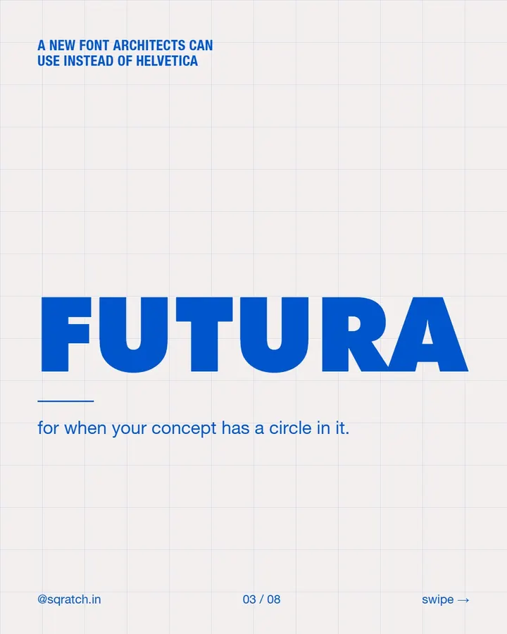
Large blue Futura specimen on a grid, with a line about circular concepts.
Available slide 3 of 4
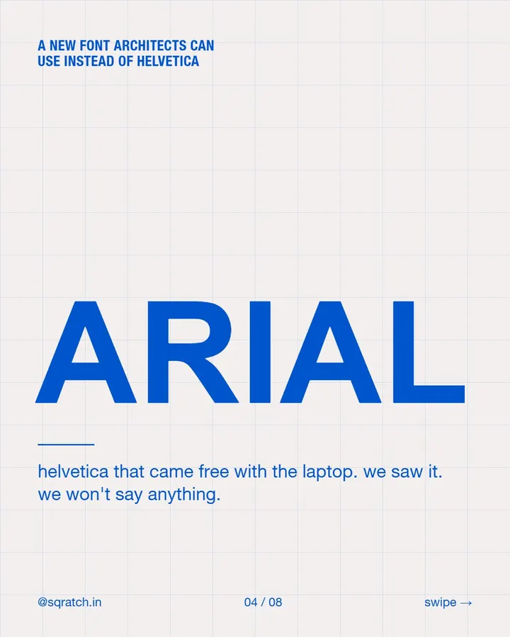
Large blue Arial specimen on a grid, with a wry line about default fonts.
Available slide 4 of 4

Four image slides are available here from a 8-slide post. From our own feed. Not client work.

← back to workstart a brief